
GZM
From Data to Dynamics – reimagining the Metropolitan Socio-Economic Observatory for the modern age with a user-centric approach.
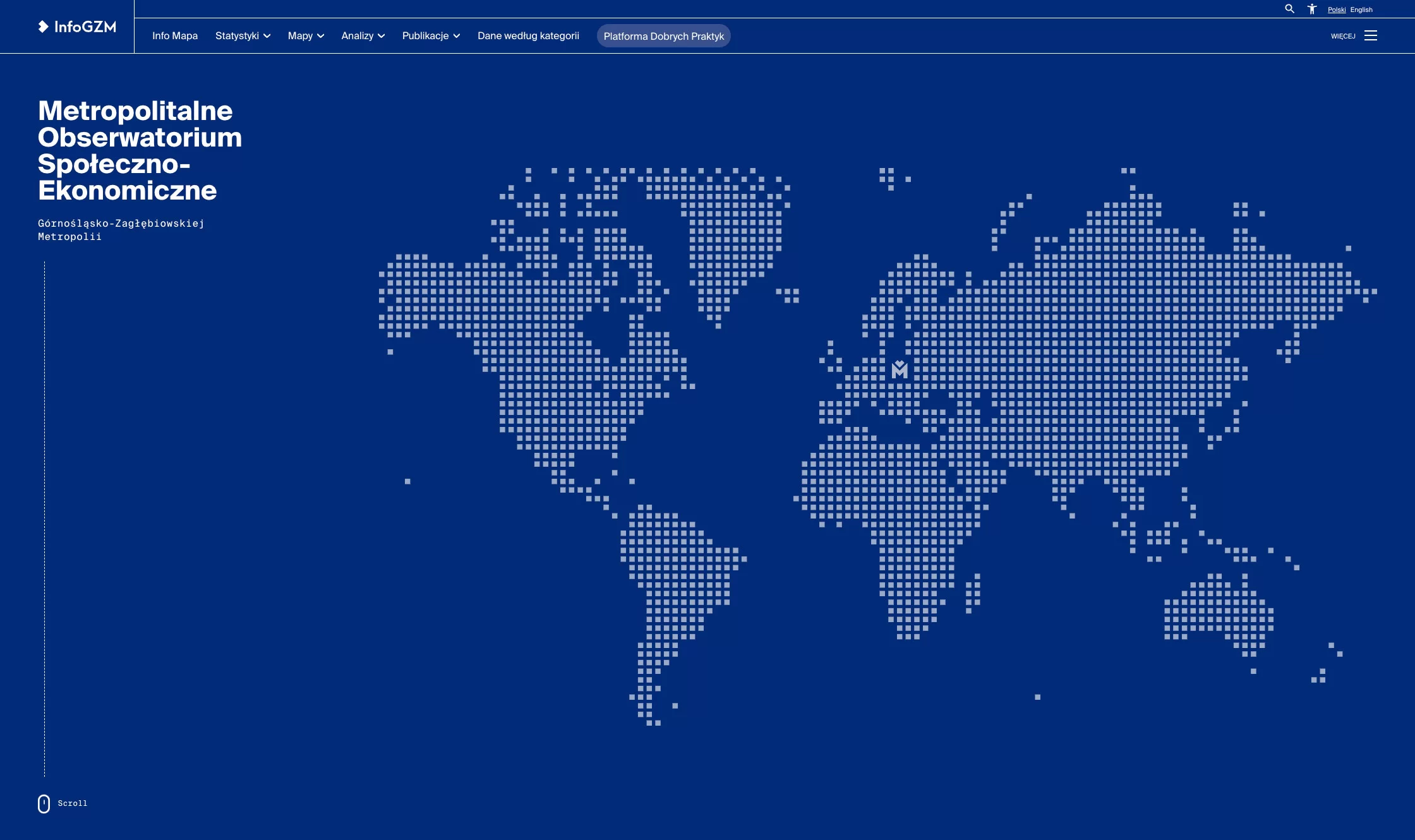
About GZM
The GZM Metropolitan Socio-Economic Observatory gathers, processes, and analyzes public data related to the GZM area, keeping an eye on evolving trends and shifts happening within the region.
This data plays a pivotal role in shaping GZM’s socio-economic strategies, being a valuable resource for various departments within the metropolitan office. The platform provides a comprehensive snapshot of individual municipalities and the wider GZM region, from demographics and economy to finances, infrastructure, and the environment.


Timeline
1400 working hours from the project’s launch till its final release
First meetups, Design phase, Development phase
May 2022
Handing over
the finished product
March 2023
Ongoing development phase
and additional ideas
April 2023 – till now
BUSINESS NEEDS & GOALS
The process of managing and presenting data was cumbersome, time-consuming, and required the assistance of team members skilled in coding to handle the website’s backend. Thus, the client’s primary business goal was to both present the data in a clear and accessible manner as well as achieve a greater degree of independence in content management.
An additional requirement was to ensure a seamless transition from their current website, retaining all existing options and features without any loss in functionality or content. Our client’s vision was clear: they aimed for a fully functional replica of their current site but with a much more manageable backend.
Initial Phase
We developed three homepage mockups to capture the desired project feel based on the client interview, insights from their current website, and the provided documentation. Using them as our foundation, we designed specific views for various site sections – including maps, statistics, analyses, and publications. Additionally, we created mockups for news updates on the blog.
Then, we proceeded to craft three visual versions of the homepage to present a diverse range of design possibilities. In the midst of this process, we received an unofficial design system, which the client intends to use in the coming years. Our challenge was to harmonize our designs with this system while adhering to the prescribed functional guidelines, ensuring a seamless integration of aesthetics and utility.
1st Development
PHASE
-
01.
Static content
This stage focused on integrating static content into the WordPress platform. It entailed incorporating non-dynamic information such as publications, analyses, project lists, and tender procedures, ensuring they were efficiently organized on the site for easy navigation.
-
02.
WP components
We prepared a series of WordPress components on the backend tailored for the editor’s convenience.
-
03.
Mobile version
We also paid special attention to the mobile version of the site, ensuring its full responsiveness and adaptability to various screen sizes.
-
04.
WCAG standards
We also implemented optimizations aligned with WCAG standards, such as adjusting font sizes and contrasts, providing a cohesive and accessible user experience.
2nd Development
PHASE
-
01.
Infomap Module
We debuted an interactive Infomap Module, allowing the client to attach diverse content, create legends, select colours, and segment data by cities or municipalities. Its functionality is driven by the Leaflet module, allowing admins to display unlimited maps embedded within a cartogram and upload necessary data directly to WordPress.
-
02.
Statistics
The Statistics section got a boost with tools such as Leaflet, GeoJSON, and amCharts. Now, users can input various indicators for specific statistics, see trends in growth or decline, and access an additional sidebar that reflects dynamic changes. The legend is entirely manageable, with an option to display data for academic purposes or even download entire statistics.
-
03.
Unique links
Data is primarily fetched from GeoJSON or CSV files, but the system also supports manual additions. Actions performed by users are saved during their session, enabling them to generate unique links after navigating through the module. These links showcase specific charts with chosen data and colors, presenting a custom map layout with desired settings, and can be easily shared or embedded elsewhere. Currently, there are 318 different statistical indicators, with more in the pipeline.
-
04.
Charts
We have prepared both backend and frontend support for a set of charts, including bar graphs and pyramids. Using the capabilities of amCharts, we’ve developed them as independent WordPress components so that they can be seamlessly added to a website without any technical interventions. Now, they allow the configuration of various charts and facilitate easy copying and duplication.
-
05.
The Green GZM Map
We’ve established a dedicated section within WordPress that gathers data about parks, squares, playgrounds, and recreational areas. Each of the enlisted places has its unique subpage, complete with a gallery, supplementary details, the area’s size, accessibility information, as well as fauna and flora. The repository is continuously updated with new sites on an interactive map where users can explore them in detail. The map features tooltips, filtering options, and the ability to showcase different layers, ensuring a user-friendly data presentation.
-
06.
Visit GZM
Visit GZM is a platform designed primarily for tourists, aiming to advertise and promote the region. It has an interactive map with filters, a dynamic sidebar, tooltips, and more. Tourist attractions are categorized into several primary groups, and each of them is further divided into more detailed sub-sections. Users can see recommended sites and information about whether the attraction has an entrance fee or is free of charge. The platform is continually updated, boasting 385 unique places, and offers the flexibility to add new categories and sub-categories. The customizable design allows for specific category displays, color coding, and other tailored modules. Future development plans include the addition of cycling routes.
Summary
Business enhancement
Streamlined process
The new updates eliminated the need for dedicated coding expertise, resulting in a more streamlined process. Transitioning to WordPress has also facilitated the easy addition of indicators without the previously encountered challenges.
Modern website design
The aim was to craft a site that diverges from the typical bureaucratic ones. The aspiration was not only for an upgrade but a transformative leap to a modern, user-friendly interface
Engaging information hub
The website was envisioned as an informative hub that attracts users with its engaging design, making information retrieval seamless and enjoyable.
Friendly data presentation
Information on the portal is visually engaging, using maps, charts, diagrams, tables, and summaries, ensuring it’s both attractive and easy for users to digest.
Collaborative Design & Development Process
The design and functionality process was continuously consulted, involving several approvals from the client, who was engaged in extensive discussions in the project’s initial phase. Such collaboration ensured the perfect blend of functionality and design.
Editor-Friendly Interface
The platform has been made more editor-friendly, enabling the easy creation of interactive maps from various areas and themes, available for future use without additional costs.
Outcome
The refreshed website has received commendable reviews, marking a significant step forward as the primary go-to place, aiming to be a tool that accumulates comprehensive knowledge for anyone visiting Silesia or needing thorough socio-economic information for any purpose.